A digital portfolio app for students with AR integration.
Product Design
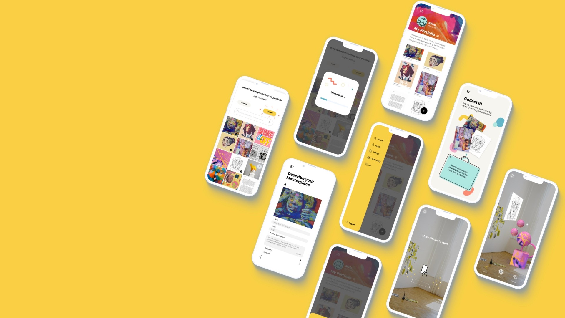
Overview
I was part of a team that designed a product to help students share and collaborate on student's creative work with an Augmented Reality (AR) element. Our goal is to solve a significant problem for students and parents.
Challenge
Parents struggle to decide what to do with all their children's precious artwork and keepsakes. Years of collecting their work, taking up lots of space.
Proposed Solution
A digital portfolio-building app for students K-12. It keeps track of their progress and shares their creative work. Our app would allow students to digitize their work and also interact with their creations in AR!
Target Users
K-12 students (Primary)
Parents
Teachers
✌My Design Process

Design Thinking Process diagram
Research Process
To better understand just how broad this problem is, we started looking at existing data on the amount of school work created by students. To test our hypothesis and gather user insights, we conducted a survey plus interviews with students, parents, and teachers. The survey provided some data points, and we were able to gain in-depth insights from students at various grade levels from user interviews.
See my full research deck with detailed findings, follow link here. 👈
User Stories
From the interviews and survey conducted so far, we incorporated the user needs by defining each user's goals. From these user stories we start to see some common pain points and needs.
Storyboarding
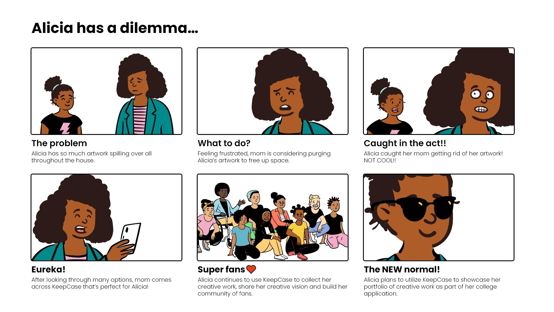
I created a storyboard to help us focus on our primary user and their pain point. Using the student persona in the scenario of catching her mother getting rid of her artwork.
A classic scenario!
User Personas
From the empathy mapping exercise, I synthesized all the user pain points and concluded five common themes:
Space/Storage
Emotional connection
Ease of access
Sharing
Organization
I developed 3 user personas based on the user types and their common themes.
Information Architecture
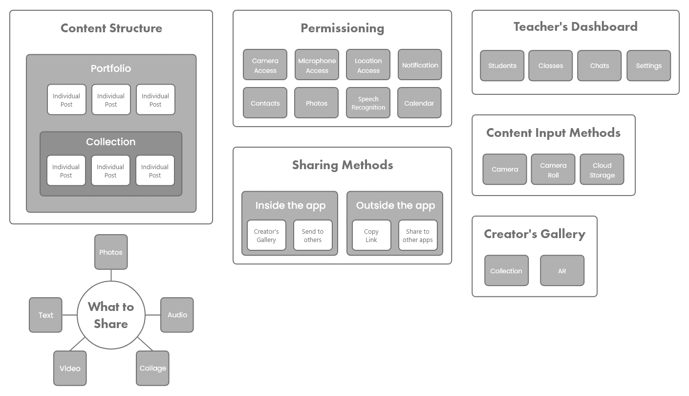
Before we started designing screens, we went through rounds of discussion and card sorting exercises to get a clear team alignment in the way each section of the app will be categorized and structured.
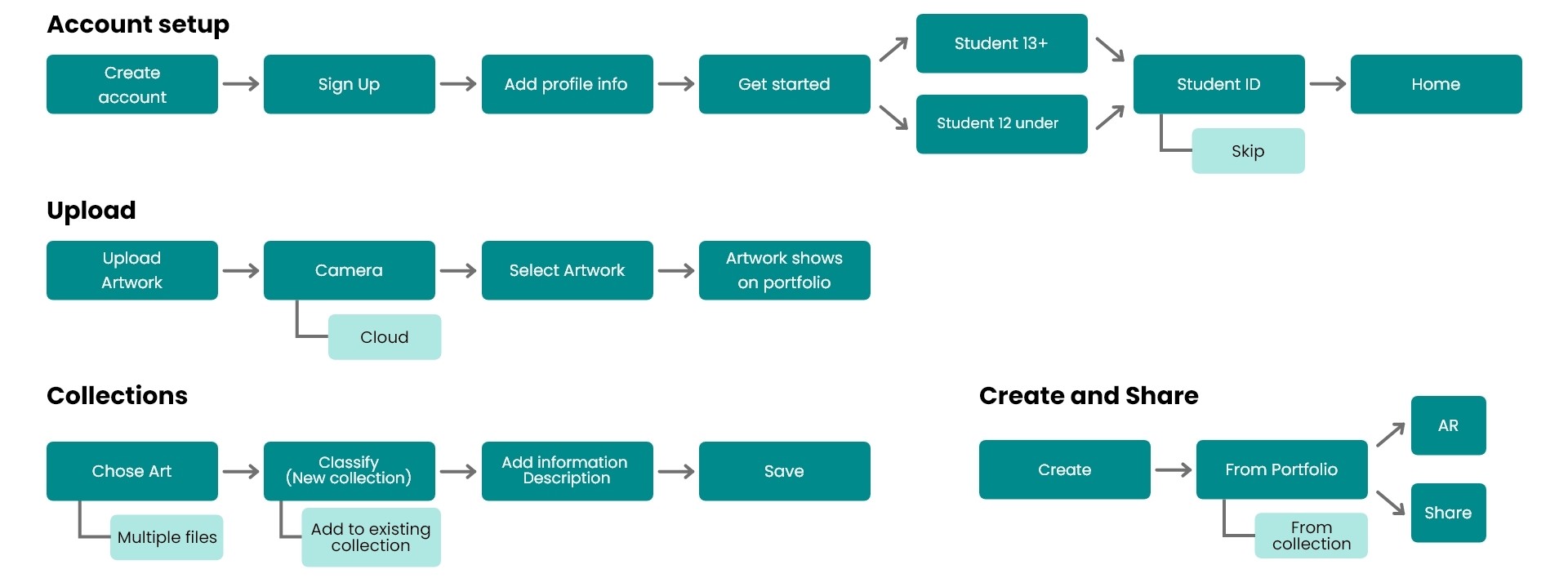
Workflows
Once we were aligned on the structure and categories of various section of the app. We set out to lay out the step flows of the app based on their tasks.
Sketches & Wireframing
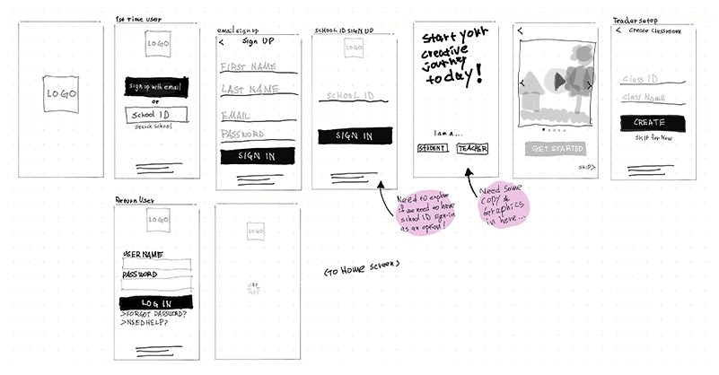
We created low-fidelity sketches. This allowed us to see what the different sections would look like and begin to visualize on a high level all the pieces the app would need.
We started creating low-fidelity wireframes. This lets us quickly iterate through many design options. Initial low-fidelity screens gave us enough of a prototype to start usability testing with our users.
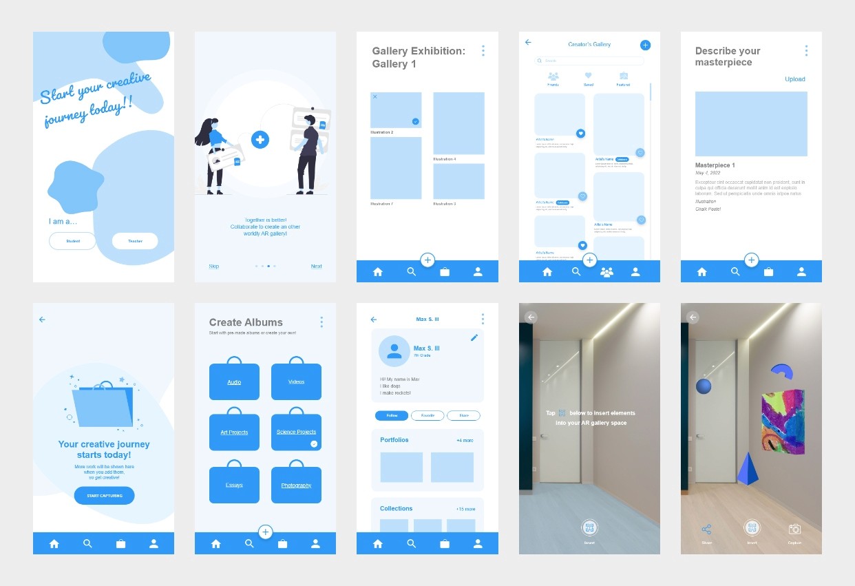
High-Fidelity Prototyping
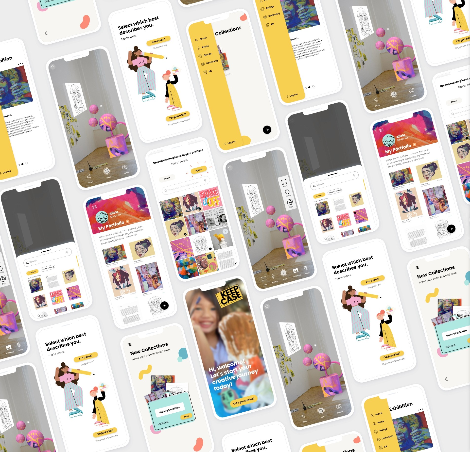
We moved on to high-fidelity prototyping after initial usability testing and implemented discoveries from those tests.
Usability Testing
Before launching the product, we conducted usability tests to reveal possible usability issues.
Testing Criteria
Navigation
Ease of use
Tests were done on both how-fidelity and high-fidelity stages
In-person moderated testing
Tests conducted with both students ages 8-10 and adults
We decided to create two separate paths to help differentiate two user groups and their needs.
We simplified our collections feature to make it easier for them to organize their work.
We eliminated the button at the bottom corner and revised the CTA button copy to provide a clear next step.
Iteration
By conducting multiple rounds of usability tests, we were able to continuous to refine and advance our design in meeting the user goals.
Next Steps
Users
Map out and design path for kids
Our project focused on the path for students 13+. We would map out the path for younger students with simpler and minimal features.
Organization feature for teachers
From our user interviews with teachers, they are looking for ways to show the creative process. Teachers will have a different experience with the app. Focused more on organizing students in the classroom, showing creative process, and assigning creative prompts.
Social
Creator's gallery
A space for students to showcase their creative work.
Collaboration with others in AR gallery space
We want students to be more immersive in each other's creativity by creating a space for them to interact and collaborate in an AR environment.
Rounds of iterations
Usability tests conducted
Screens
Hours of Zoom meetings🤪
Reviews
“I was very intrigued by the virtual art space app that your team created! I had an art gallery in Dallas a few years ago and I think this is a very great way to engage with art. Well done!”


Natasha
My Take-Aways
This was a great project and I came to learn so much from our users and our team. Working with a team of designers coming from various backgrounds was an eye-opening experience. Listening to their perspectives and their approach was humbling. Walking through our thought process throughout the whole project at each stage helped everyone to work out varying design approaches, gain clarity, and maintain alignment.
During the early stage of design, a discussion with another designer whose background is in education came up about a chat and comments feature I was designing. There was a safety concern for young children communicating with possible strangers since the app is public; although it can be used in a school system, technically anyone could sign up. The other concern was possible cyberbullying/harassment in commenting feature. We went through many possible design scenarios, but since the chat and comments are unmoderated, we ultimately decided to hold off on this feature. The lesson here was that I started to design the chat and comments features under the assumption we needed one for the social aspect of our app. Through our discussion, I learned it not only it adds complexity to the design, but quite possibly adds harm to our users. Deciding not to design something is itself a design decision.
